Blue Rugs for Modern Interiors: Lapis, Prussian, and Midnight
How to choose a blue rug for a modern room, from Lapis and Prussian to Midnight Blue and paler blues, and how each one reacts to daylight.
Choose the blue by the light first. A north-facing room makes every blue look cooler and darker, so a bright blue like Lapis keeps its energy there while a deep navy can go almost black. A room with strong southern or western sun warms blue up, which is where Prussian and Midnight Blue look their richest.
Our Water family has three blues, each with a different job, and our Air family adds two paler ones. Here is how we use them.
Lapis for rooms that need some charge
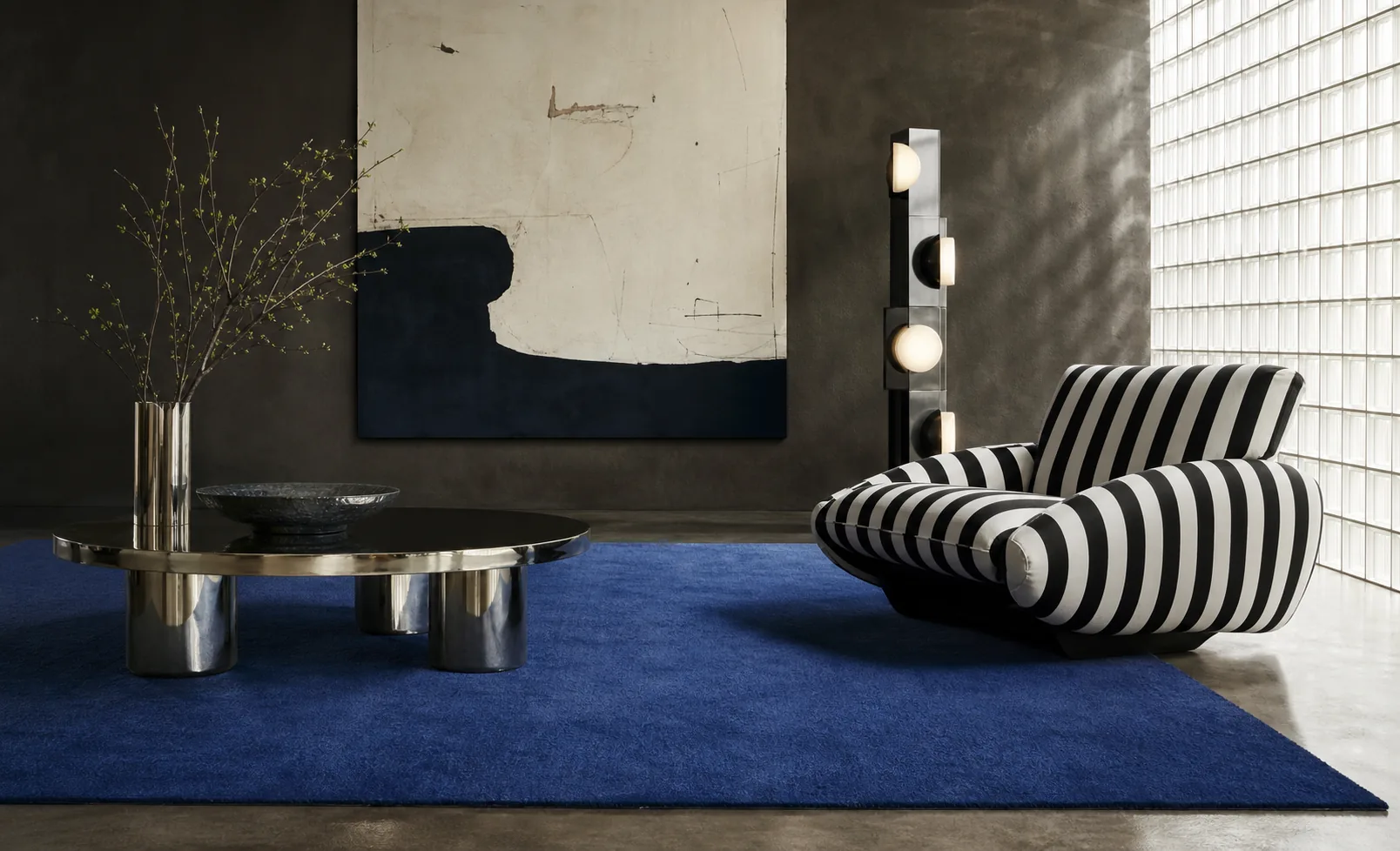
Lapis is the clearest and brightest of our blues. It reads as color first, so it suits rooms where the rug is meant to be noticed: a living room with white walls and simple furniture, a study, a dining room under a pale table. It works well with chrome, glass, black steel and warm reds.
In a small room, Lapis can feel like a lot. We like to leave about 18 inches of floor showing around it, so the color has a clear edge to stop at.
Prussian beside wood and leather
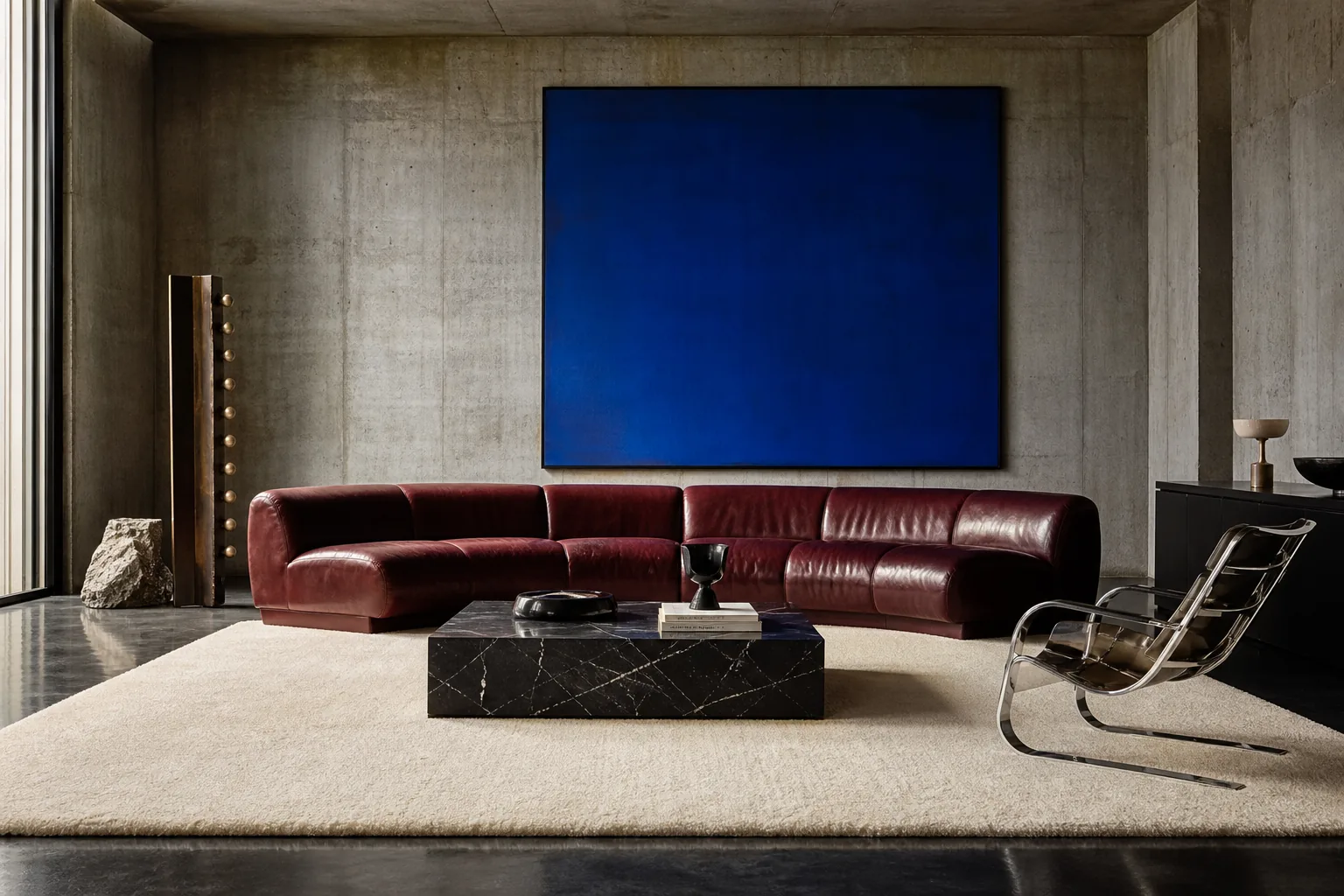
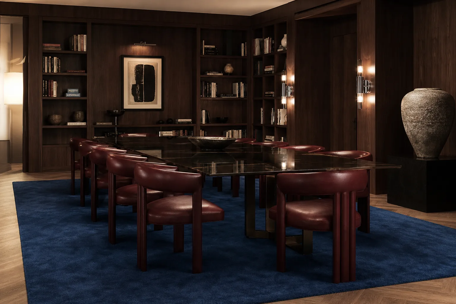
Prussian is deeper than Lapis and more reserved. Next to walnut, oak, oxblood leather and brass, it settles in and starts to act like a neutral, the way navy does in a suit. It is our usual suggestion for paneled rooms, libraries and dining rooms where the furniture is heavy and warm. It also hides everyday wear better than a bright blue does.
Midnight Blue as a dark base
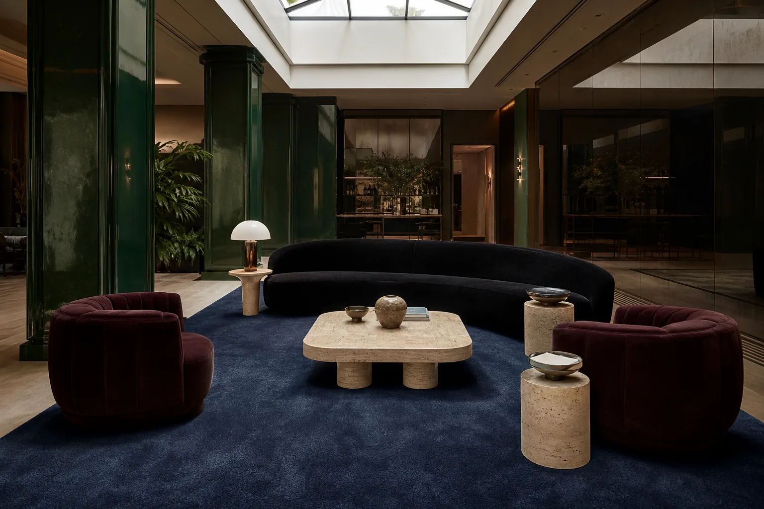
Midnight Blue is the deepest of the three. In most light it reads as a dark ground for the room, close to charcoal but softer. Use it where you might otherwise choose a dark gray or black rug: under a pale sofa, in a media room, or anywhere you want the furniture to stand out against the floor.
One practical note. Dark rugs show lint and pet hair more than mid-tones, so plan on vacuuming a little more often.
Paler blues from the Air family
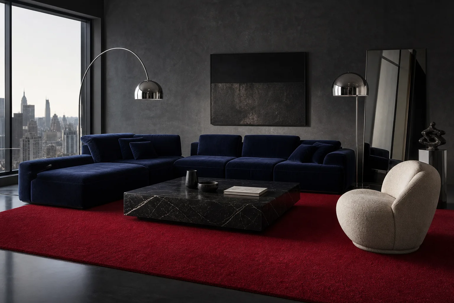
Horizon and Periwinkle bring blue into a room without the weight. Horizon is light and open, and it pairs well with dark or wine-colored walls where the rug should lift the floor. Periwinkle leans toward violet and is lovely in a bedroom. Both show soiling sooner than the Water blues, so they suit rooms with lighter traffic.
If one blue on its own feels too strong, our Thick collection sets a calm center inside a broad border in a second color. Prussian / Periwinkle stays within the blue family and works in a bedroom or a quiet living room. Lapis / Brick pairs blue with a warm red border, a good match for terracotta, rust or tan leather. Intense starts at $2,160 for a 6 x 9, and Thick starts at $2,592.
How to test a blue sample at home
- Lay the sample on the floor where the rug will go. Blue looks different at your feet than on a table.
- Check it in the morning, mid-afternoon and under lamps at night. Warm bulbs tend to make blue look grayer.
- Set it next to your sofa fabric and a piece of the flooring, away from bright white walls that skew the comparison.
- Compare two blues together. Choosing between Lapis and Prussian side by side is much easier than judging one alone.
Remember that a full rug reads stronger than a small swatch. If you are torn between two shades, the softer one usually lands closer to what you pictured.
You can see every blue at full scale in the Intense collection. When you have narrowed it to two, request samples and look at them in your own light for a few days before you decide.